Accessible Inspection Software
InspectForge is designed for every inspector — whether you work in bright sunlight on a rooftop or a dim crawl space, prefer dark mode or light, or rely on assistive technology to get the job done.
Our Commitment
We believe inspection software should be usable by everyone. InspectForge is built with accessibility in mind from the ground up — proper semantic markup, descriptive labels, sufficient color contrast, and touch targets sized for real-world use. Whether you're using our mobile inspection app or the report generator, we continuously improve our accessibility support and welcome feedback from users who rely on assistive technology.
Supported Accessibility Features
These features are declared on our App Store and Google Play listings.
Dark Interface
App Store DeclaredInspectForge includes a full dark mode that applies a dark color scheme across all screens, menus, and controls. Dark mode reduces eye strain during long inspection days and improves readability in low-light environments like attics, crawl spaces, and basements.
How to Use
- 1Open the app and tap your profile avatar in the top-right corner
- 2Scroll down to find the Dark Mode toggle
- 3Tap to switch between light and dark themes
- 4Your preference is saved automatically and persists across sessions
Sufficient Contrast
App Store DeclaredAll text and interactive elements in InspectForge maintain sufficient color contrast ratios against their backgrounds. Our color system was designed with contrast in mind — both in light mode and dark mode — so labels, buttons, status badges, and form fields remain clearly legible in any lighting condition.
How to Use
- 1Contrast is built into the design system — no configuration needed
- 2Status badges (Pass, Action Required, Flag) use both color and text labels
- 3Dark mode uses a carefully chosen palette with light text on dark surfaces
- 4Error and success states use distinct, high-contrast colors
VoiceOver
App Store DeclaredInspectForge works with Apple VoiceOver and Android TalkBack screen readers. Interactive elements include descriptive labels, form fields are properly associated with their labels, images carry meaningful alt text, and screen-reader-only descriptions are provided where visual context alone is insufficient.
How to Use
- 1Enable VoiceOver in your device Settings (Settings → Accessibility → VoiceOver)
- 2Navigate InspectForge using standard VoiceOver gestures — swipe to move between elements, double-tap to activate
- 3Form fields announce their labels and current values
- 4Buttons and icons announce their purpose (e.g., "Show password", "Close")
Differentiate Without Color Alone
App Store DeclaredInspectForge never relies on color as the sole way to convey information. Inspection statuses use text labels alongside color ("Pass", "Action Required", "Flag"), icons accompany system categories, and progress indicators include percentage text in addition to colored bars.
How to Use
- 1Inspection item ratings display text labels (Satisfactory, Needs Evaluation, Defective) alongside color coding
- 2Report card views show Pass/Action/Flag counts as numbers, not just colored indicators
- 3Status badges on inspections include text (Scheduled, In Progress, Completed, Delivered)
- 4Alert banners use icons plus descriptive text for attention items
Accessibility in Action
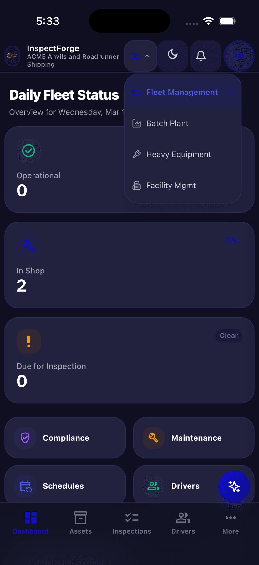
Dark Mode — Fleet Dashboard
Full dark theme reduces eye strain during early morning fleet checks and nighttime inspections.
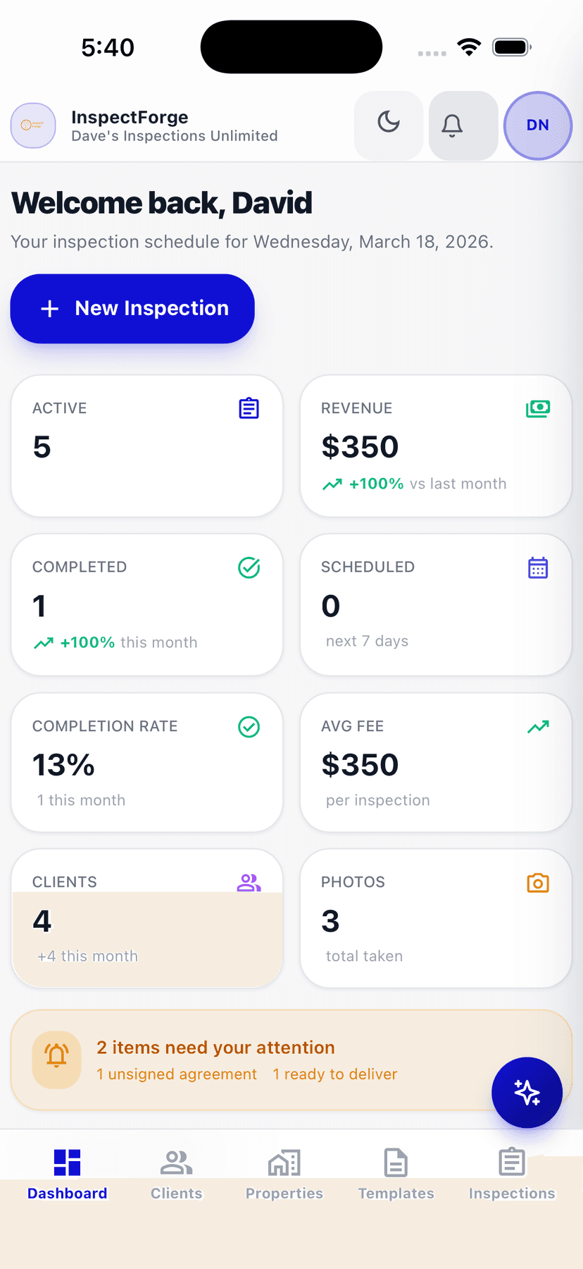
Light Mode — Home Inspection
High-contrast light theme with clear status cards and color-plus-text indicators.
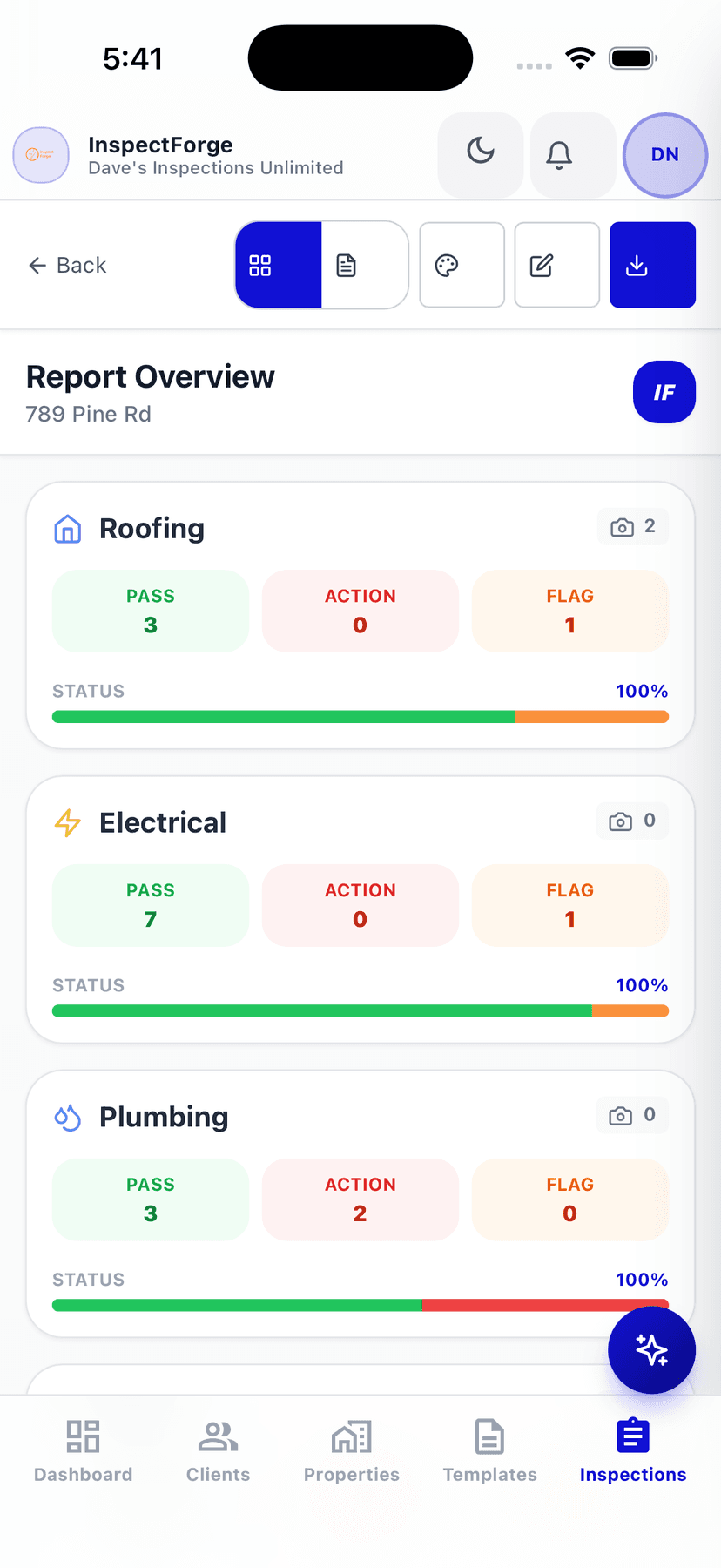
Color + Text Status Indicators
Pass, Action, and Flag counts are always shown as labeled numbers — never color alone.
Additional Accessibility Features
Touch-Optimized Controls
All buttons, links, and interactive elements meet the 48px minimum touch target size recommended by Apple and Google. The bottom tab navigation, action buttons, and form controls are sized for comfortable use with gloved hands — important for inspectors working on-site.
Keyboard & Focus Navigation
Interactive elements display visible focus rings when navigated via keyboard or assistive devices. Focus states use distinct ring outlines so you always know where you are in the interface. Form fields support standard tab navigation.
Safe Area & Notch Support
InspectForge respects device safe areas on iPhones with Dynamic Island or notch displays, and Android devices with gesture navigation. Content is never obscured by hardware features, and the bottom navigation properly accounts for home indicator spacing.
Accessibility Roadmap
We are actively working to improve accessibility in future releases. Planned enhancements include:
Reduced Motion Support
Respect the prefers-reduced-motion setting to minimize animations for users who experience motion sensitivity.
Dynamic Type / Larger Text
Support system-level text size preferences so users can scale text up to 200% or more without layout issues.
Voice Control Optimization
Add visible labels and names to all interactive elements so Voice Control users can tap, swipe, and type by voice.
Live Region Announcements
Use ARIA live regions to announce dynamic content updates like inspection progress changes and sync status to screen readers.
See It for Yourself
The best way to evaluate accessibility is to try the app. InspectForge offers a free trial with full access to all features — including dark mode, report styles, and the MI6 AI assistant.
Accessibility Feedback
We take accessibility seriously and want to hear from you. If you encounter a barrier using InspectForge, or have suggestions for how we can improve, please reach out. Your feedback directly shapes our roadmap.